Demo build
Longform Audio
Independent audiobook publisher, Bristol · 2026
The problem
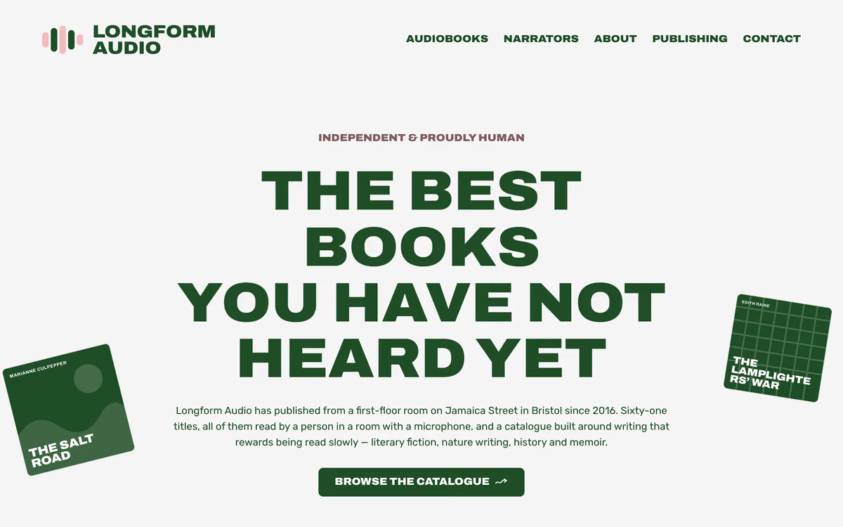
A publisher's catalogue is images by default, which means a slow page, blurry type on a good screen, and titles that search engines and screen readers cannot read.
What we built
- Eight title pages generated from one data file, plus ten written by hand
- Covers drawn from type and five flat SVG motifs, each with a hairline outline in its own ink so a green jacket on a green panel still has an edge
- hyphens: auto with overflow-wrap as a backstop on every heading, after “Cartographer's” measured 386px on a 375px screen and sized the whole grid column
- A variable-width display face rather than letter-spacing a 900 weight, which looks exactly like what it is
Where it landed
The build that makes the strongest technical argument in the set: artwork rendered as type is faster, sharper, readable by machines, and free to change.